What is CSC GO?
CSC ServiceWorks is a leading provider of laundry solutions for residential and commercial properties. Its digital laundry app, CSC GO, offers multi-family communities a convenient way to pay for laundry, check machine availability, and receive real-time cycle alerts — all from their mobile device.
The Challenge
After the recent launch of CSC GO, CSC ServiceWorks was looking to implement new features for their product post-MVP. One of the larger feature requests involved making adjustments to the log in and account creation flows.
In several laundry rooms, CSC had physical kiosks that allowed users to sign up for an account using their mobile number. The team wanted to bring this functionality over to the CSC GO app, so users who had registered on a kiosk could seamlessly log into the mobile app.
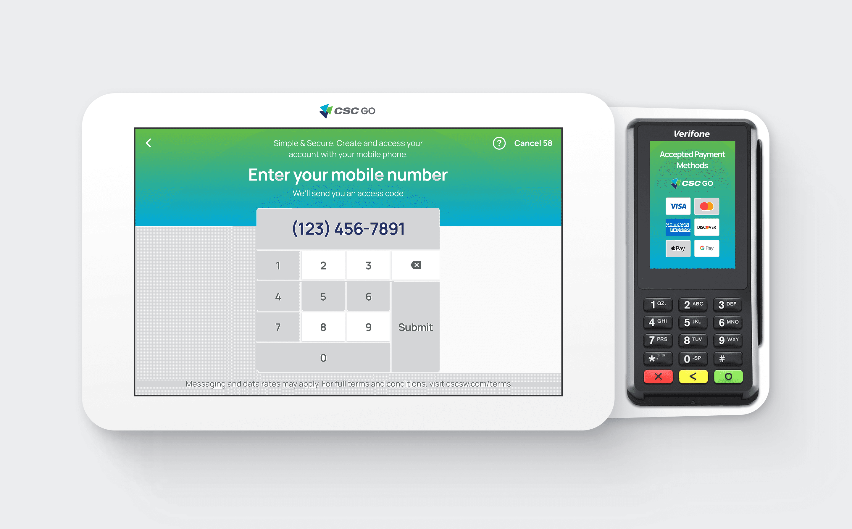
If CSC GO is not their first touchpoint, users have the option to create an account by entering their mobile number on a kiosk. Our goal was to bring this functionality over to CSC GO.
CSC assumed we simply needed to add a button to the existing sign-in/sign-up screen. However, because using a mobile number was a completely new way to access or create an account, I dug into the UI to see what kind of impact this new button would have to the overall app.
Uncovering A Larger Issue
Upon investigation, I found both the process of registering a new account and logging into an existing one to be confusing. The two flows were condensed into one screen, with messaging that made it unclear whether a user was signing up or signing in.
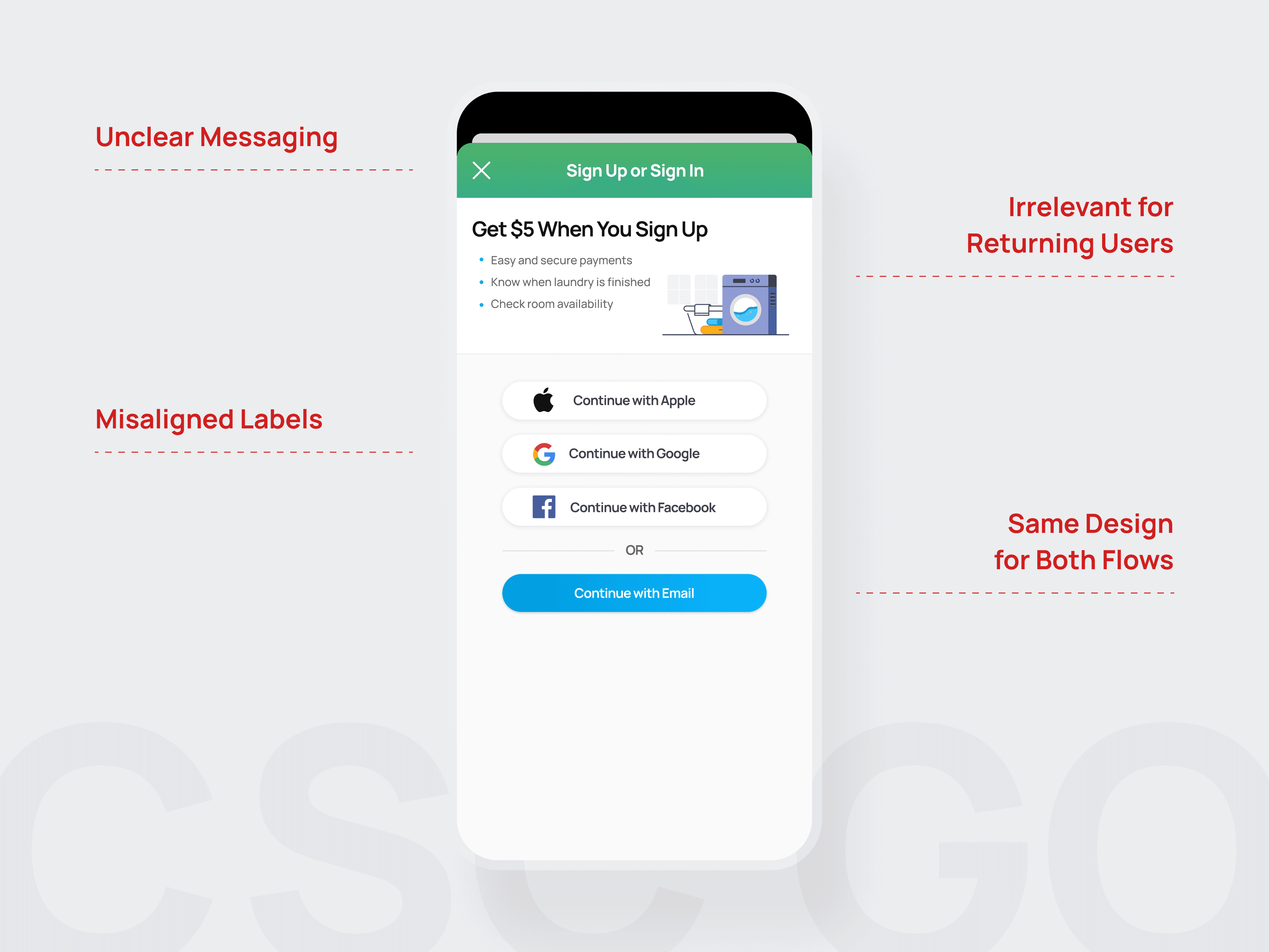
The current design had opportunities for improvement.
Taking Inventory & Establishing A Game Plan
With only the UI to reference, I decided to take a step back and create rough user flows of the current sign-in/sign-up journey. This gave me a bird's-eye view, allowing me to illustrate gaps and flag issues to the client.
After reviewing my findings with the team, we determined that the existing UI needed to be reworked before we could introduce a mobile number aspect. At the same time, we needed to account for users who wanted to use the app's basic functions, without having to immediately sign up for an account. (Known as "guest users.")
Expanding the User Journey
I revisited the flows to make adjustments, flesh out details, and establish a more formal user journey. After researching apps with similar functionality, and leveraging Jakob's Law, I began adding in the flows for signing up and signing in with a mobile number. I ensured my decisions were intentional and predictable — I wanted users to expect CSC GO to function the same way other apps do.
"Users spend most of their time on other sites. This means that users prefer your site to work the same way as all the other sites they already know."
Jakob's Law, Laws of UX
With frequent check-ins, I was able to gut-check my work with the team every step of the way.

Outlining the full user flow kept us aligned as we moved into UI.
Revisiting the UI
Once the user flows were in a good place, I began exploring revisions to the UI. By splitting up the sign-in/sign-up screen, we were able to focus our messaging and bring clarity to the difference between each path.

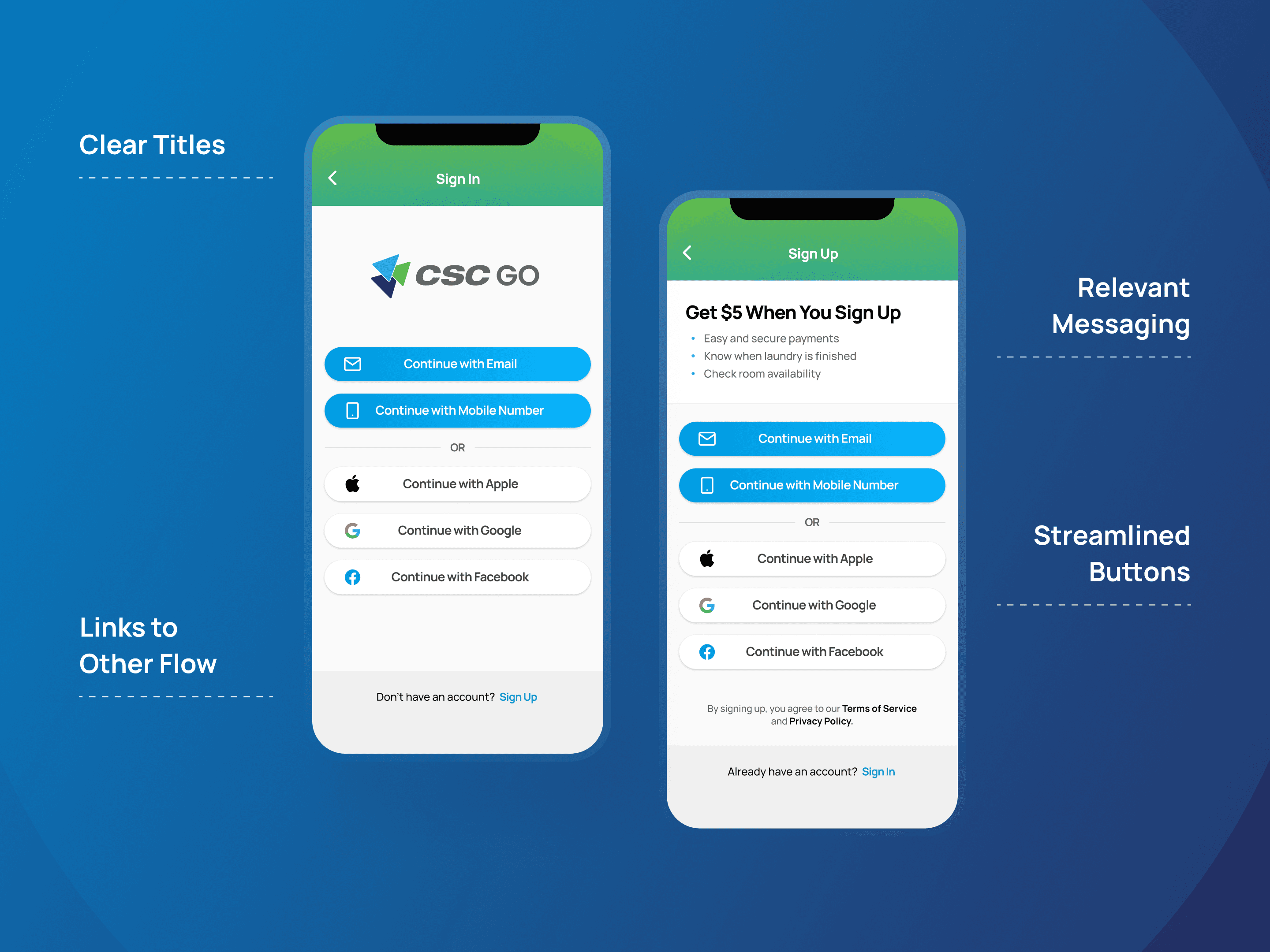
Small differences help reassure users that they're in the right place.
Using a mobile number to sign in and/or sign up was a new functionality, so it had a few more aspects to think through. I made sure to account for all potential use cases of sending and receiving verification codes to authenticate a device. While these were technically new screens for the app, the design system I had established allowed me to quickly create the assets I needed.

Screens in the new mobile number authentication flow.
The Result
Improving the Overall User Experience
The CSC team was excited to have a more developed, thoughtful, and less confusing sign-up and sign-in flow — especially since this would be many users' first experience with the CSC GO app.
A New Way to Access CSC GO
We successfully established a new method of signing up and signing into the app, minimizing friction for new and returning users.
Consistency & Predictability
By adjusting the sign-up and sign-in flows to function similarly to other apps, the CSC GO experience became more predictable and familiar to our users. On top of that, utilizing the design system I had previously established allowed me to maintain stylistic consistency, even with the addition of new screens.
Groundwork for the Future
The updates we made laid the foundation for future improvements. In 2022, we launched a feature that simplifies logging in for returning users by storing their previous authentication methods.

Takeaways
Mapping out the complete user journey before diving into a new feature request is invaluable. Not only does it create team alignment, but it also reveals hidden gaps and opportunities in existing flows that might have otherwise gone unnoticed.